Modern conference room with a long table, black chairs, a large blank screen, a globe on a pedestal, and green ambient lighting.
Scandinavian Hospitality

Luxurious hospitality grounded in nordic nature and design tradition

Scandinavian Hospitality offers outstanding holiday experiences in the nordics. They turn some of Sweden's most exclusive residences in to 5-star private hotels for a small international group of travellers. Their digital presence was in need of an update so it would reflect the exceptional quality of their service.
The work
Brand Design
Web Design
Development
Tools
Figma
Webflow
Cursor
Techniques
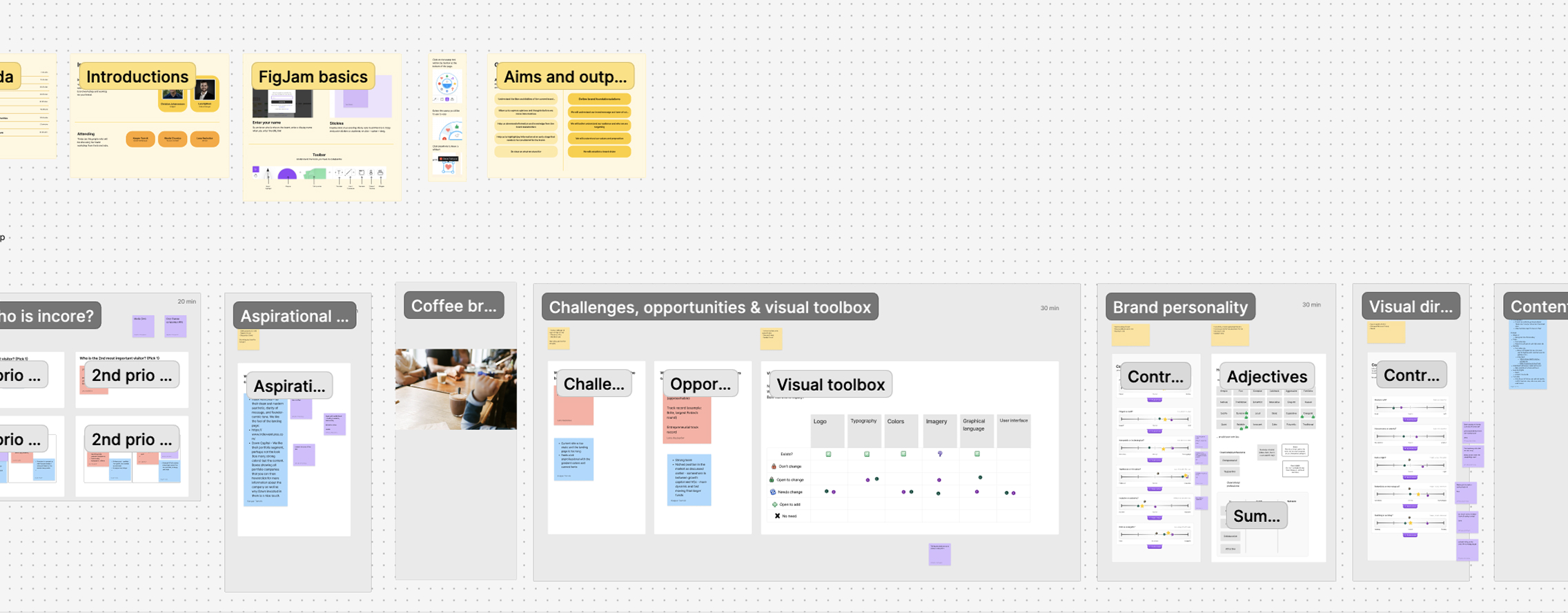
Workshops
Prototyping
Low-code implementation
CSS
I started with a brand workshop to better understand which kind of change they were looking for. The aim was to make a lot of fast decisions to quickly lay the ground for creative work.

Traditional vs. modern, decorative vs. simplistic

Based on the workshop, a conflicting ambition was identified between tradionality and modernism. On the one hand the strive for trust by familiarity within the luxury category, on the other hand it should be fresh, modern and stand out.

Traditional luxury is rich in ornaments and decoration. Modern luxury is usually associated with minimalism of which scandinavian design has become synonmous with. Scandinavian design whether it's furniture or architecture – is rooted in strong values of simplicity and balance. These values are almost in direct conflict with excessive luxury.
A sentence that came up in the collaboration was "Our clients are tired of the french Riviera". By focusing on what makes our offer unique, we can give our clients an elevated experience that is set a part from the rest of the worlds luxurious institutions.

When we sell holiday experiences for UHNWI's, we shouldn't fit in – we should stand out. The competition is not another luxury hotel, but a collonial Villa in Vietnam. Authenticism is key to gain trust.
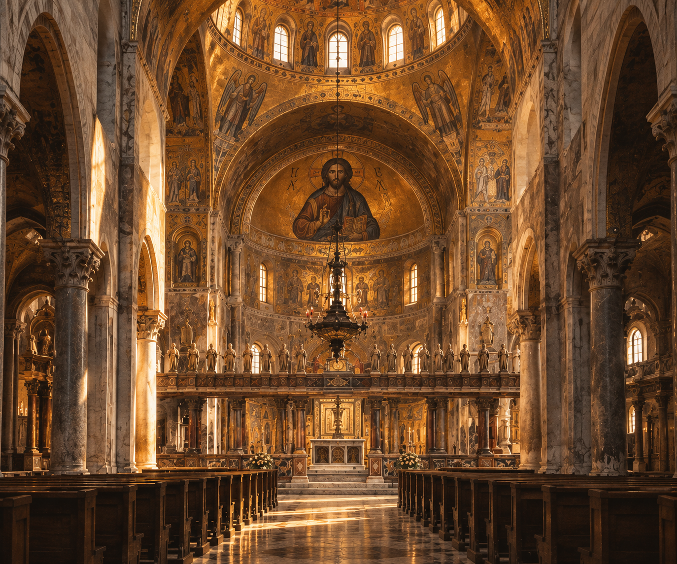
Ecclesiastic grandeur
Traditional
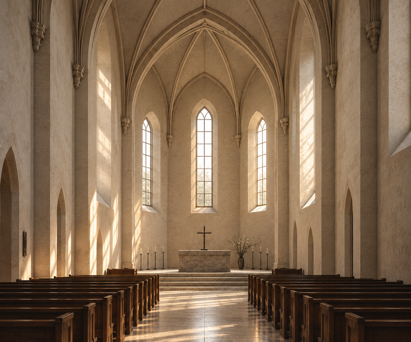
Modern
Scandinavian asceticism
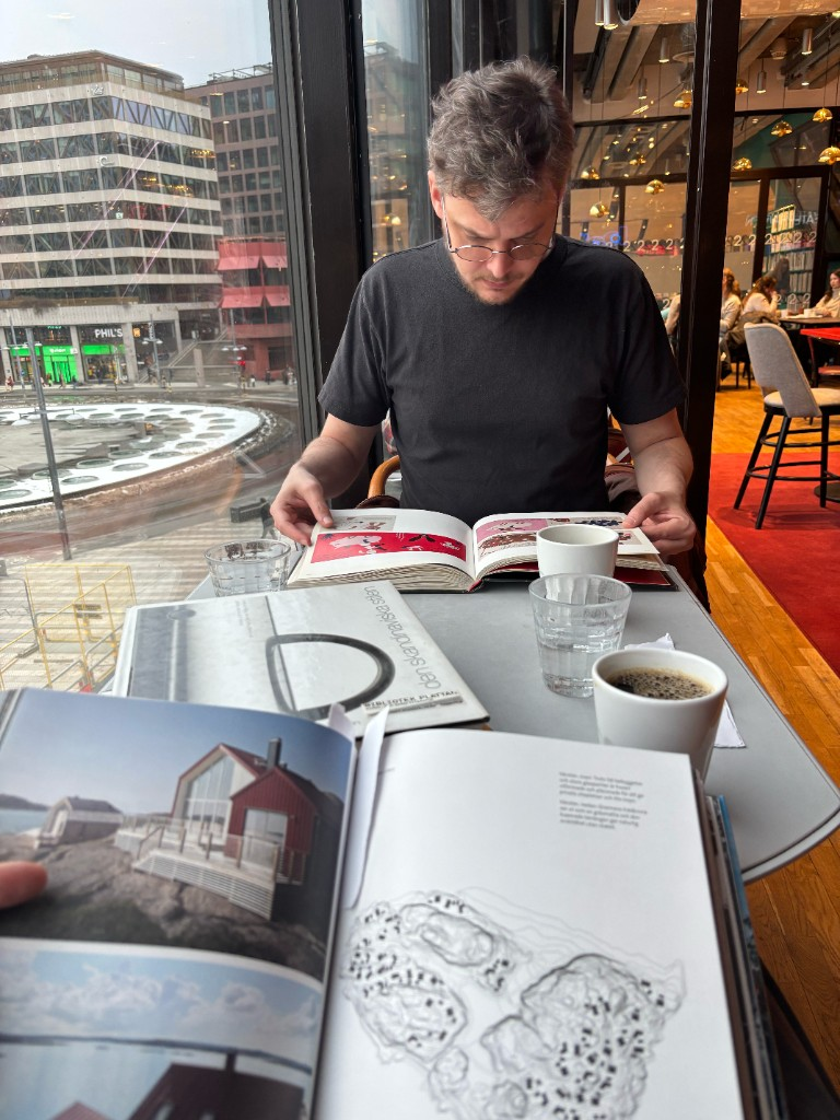
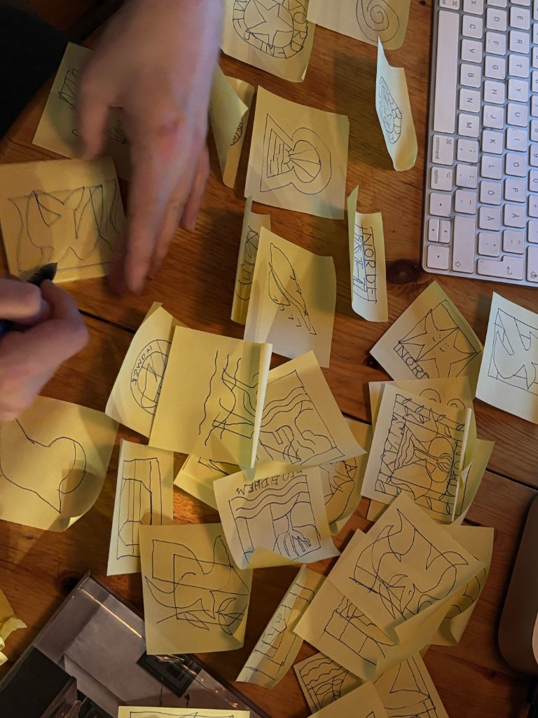
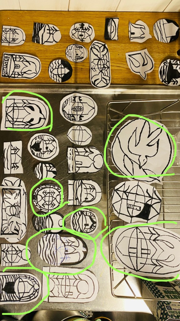
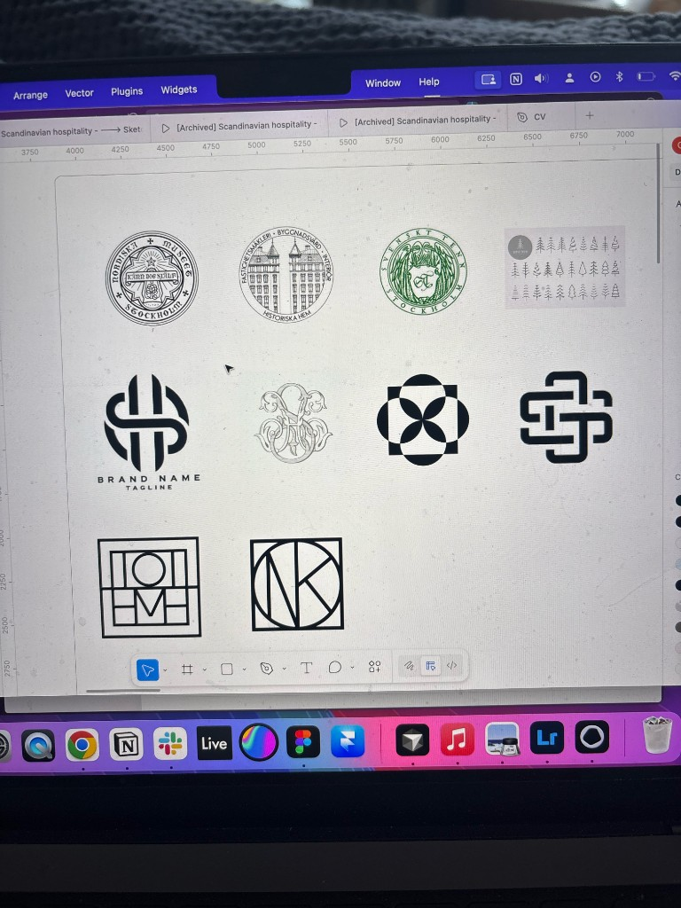
After the strategic direction was set, the branding exploration started. It consisted of trips to the library, late nights sketching with pen and paper, generating examples and having conversations with the client. An idea of an emblem grew. It communicates both quality, tradition and craft.

What characterizes Scandinavian Design?

Scandinavian church interior in pale wood and daylight.

Origin in everyday life and material

The Scandinavian form grew out of a life close to nature, marked by scarce resources, local materials and self-sufficiency. Simplicity, function and durability were not a stylistic choice, but necessities — shaped by smallholders, fishermen and craftspeople.

Refinement without excess

Through influences from the continent during the 1700s and 1800s, the expression was refined, but without losing its restraint. Light, pale colors, rational proportions and classical ideals were adapted to the Nordic climate and mentality.

Democracy and modernism

During the 1900s, good form was linked to the democratic ideal: beautiful, functional products should be accessible to everyone. “Less is more” became a natural attitude rather than a dogma — where usefulness and aesthetics coincide.

A living heritage

Scandinavian design is not a uniform style, but a shared attitude: respect for nature, honesty of materials, and a striving for meaning through simplicity. It is a heritage that continues to be reinterpreted, rather than reinvented.

Designing the Scandinavian Hospitality brand

The perfect balance between modern and traditional were found in a locally rooted typeface in the intersection between 1920's classicism and 1930's modernism. A seemlingly modern typeface with a slight edge – appearing in the national exhibition of Stockholm around that time. This happened during a time where many more people than before had the possibility to get a second vacation home. The font goes well together with both 1700's castles and modern design villas.
The symbol depicts a home on an island in the archipelago with the sky reflected. The meaning is multilayered with evocative associations to the elements, nature, design tradition and tainted glass seen in many churches. An emblem is also widely used as a symbol for quality, craft and tradition by swedish luxury brands like Svenskt Tenn, Toteme and Nordiska kompaniet.
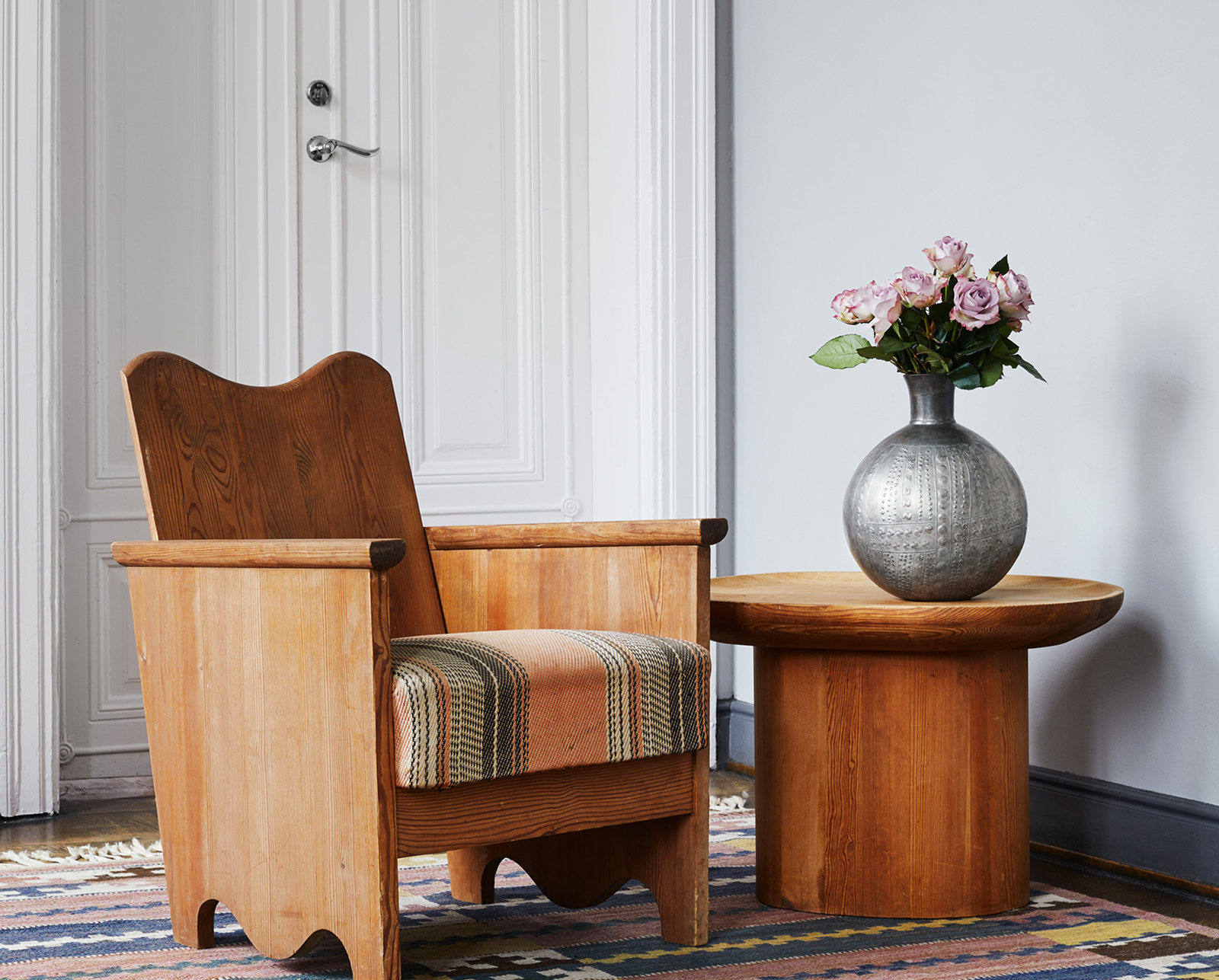
A decision was made to let the outstanding homes speak for themselves, with the brand being less reliant on graphics or color. Analogue photography stand the test of time and give a subtle hint of the historic value in many of the homes.

Designing the layout

While adressing structure and coherence in the design – visiting the site should feel like reading an exclusive interior magazine. Dynamic layouts, use of negative space and smooth UI animations created exactly the elevated experience we were looking for.

Development and final implementation

While maintaining deep control over layout in Webflow, a big set of tasks was made much more efficient with help of AI.
Downloading and sorting of +3000 images in USP's, Living spaces, Bedrooms & Bathrooms and Outdoors. This allowed for a more structured way to present the homes and make comparison easier for the visitor.
Structuring the unstructured data with AI – bedrooms, guest capacity and amenities. Allowing the user to find the right home faster with filtration. Creating structure both for the visitor and the publisher.
A solid solid and easy to use CMS that enables my client to manage the page and content in a safe environment, with built-in guidance on which content goes where and constraints.
Based on creative direction around analogue photo, analogue feel was emulated in CSS, controlled per house in the CMS.
AI powered sorting of attractions, based on proximity.
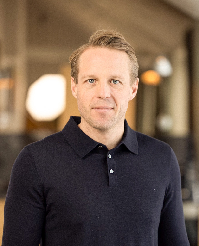
"Thank you Christian Johannesson for building our new website. We are very happy with the result and would recommend you to anyone looking to elevate their digital presence."
Martin Gunnarsson, CEO @ Scandinavian Hospitality